Burger King has stepped up their marketing game, and people wonder whether McDonald’s is being taken over!
Burger King’s New Packaging
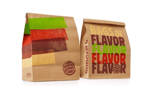
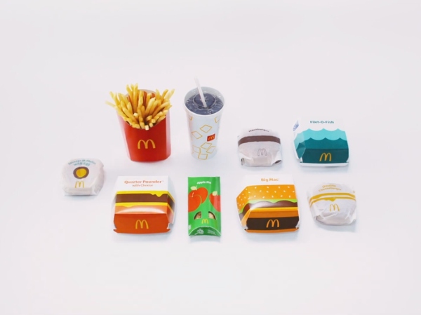
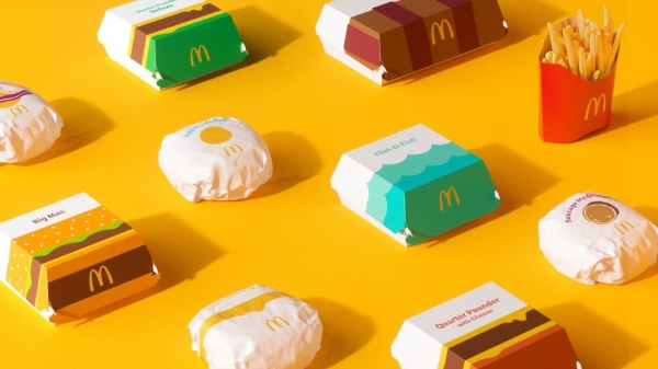
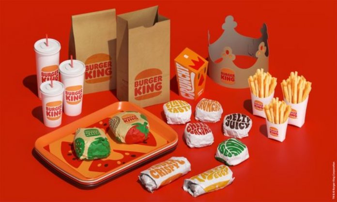
McDonald’s and Burger King have kicked off the new year with new looks, and we love it! An early survey has also shown Burger King’s fresh packaging design has edged out an overhaul with their consumers.

People Are Preferring Burger King More
Fifty-four percent of respondents have, in fact, said that they preferred Burger King’s packaging. Only 46% chose McDonald’s in the same survey which was conducted this month. Moreover, 56% of consumers have noted that Burger King’s new look made the food look more appetizing. On the other hand, 44% of McDonald’s packaging made for a more appetizing meal.
What Does This Say?
This, in fact, shows that the packaging has a huge impact on the sales of the product itself. In the 21st century, many brands have started heavily investing in the packaging department because that creates more than half the appeal.

A well-packaged food product looks more appetizing, and so, Burger King may be winning! However, the good news for both chains is that the overhauls show signs of potentially helping sales.
The CEO of the Harris Poll spoke about the effect of packaging on the fast-food company. He notes, “Fast food companies like McDonald’s and Burger King understand that the look and feel of a product. The packaging shapes how consumers think about their brand and ultimately influences what their customers choose to buy”.
What’s Special About Burger King?

Those consumers who opted for the Burger King packaging also shared why they opted for it. They mentioned that the packaging evoked nostalgia and retro vibes, which is what appealed to them more.
Burger King released its design first in January, which will eventually be splashed across everything from packaging to signage and uniforms. The look from Jones Knowles Ritchie plays on a design used by the Whopper’s Home in 1969, interestingly. “It modernized the brand but also made the brand even more classic,” Restaurant Brands International Global Chief Marketing Officer Fernando Machado has told Ad Age.
McDonald’s packaging overhaul was also unveiled this month was in the works for years and came from Pearlfisher. It was described by Barbara Yehling, McDonald’s senior director of global menu strategy, as “bright, beautiful and modern new designs.”
Stay tuned to Brandsynario for the latest news and updates.


