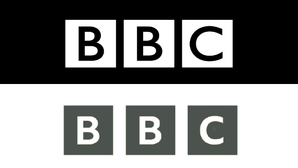
BBC, the British Broadcasting Corporation, quietly introduced its new logo this year. The moment people got to know about it, they started bashing the channel. The reason behind the bashing was that BBC’s budget comes from taxpayers’ money. And the logo, people felt, did not correspond to the amount of money spent on it. They found it to be a copy of the old logo.
BBC defends new logo
According to a publication, the channel was quick to defend its “tens of thousands of pounds” work.
But first, what does this work look like? Fresh branding, as BBC terms it, has a smaller font and more space between the letters.
Enraged, Twitter started trolling the brand on this when the news was brought to light.
I'd of done that for them and it would only have cost them a KitKat
🤣😂🤣😂🤣— Edward Niger (@EdwardNiger) July 5, 2021
The channel still stood steadfast on its stance that the cost was not “significant.”
Speaking to Metro.co.uk, the BBC spokesperson said, “We are simply using our own font – which we own the intellectual rights to – to tidy up the blocks.”
They said that the typeface is BBC Reith (the channel’s own product), replacing Gill Sans. This is an important step since, moving forward, BBC won’t have to pay for Gill Sans license.

The logo will officially be seen on screens in the fall.
Netizens on the expensive logo
While the channel tried to defend itself, the approximate amount for logo change outed by a certain publication kept getting traction. They questioned how so many pensioners could have been paid in the amount they claim they invested on the new logo, which is not even that different from what it was.
The #BBC Logo change is an absolute joke & waste of License payers cash! 'Cost not significant' ? How many pensioners Licenses could have been paid for instead? Hang your heads in shame! A corppration run by out of touch fools, with no grip on reality! @bbc @BBCOne @bbcpress
— Olivia Mechelewski (@LivStick) July 4, 2021
Lol 50k to change the BBC logo??? To something exactly the same as the old bloody logo! 50k of our money!?? This is where my TV licence money is going? Really??? https://t.co/lDYGr6n8nH
— Sandi Hirani (@Sandi_H_xx) July 5, 2021
Of course, there were some rare occasions where people with branding knowledge also tried defending the channel.
Sigh. The BBC logo change is so they no longer have to pay rights for the old font – the Reith font was designed in-house for just this reason – it will save money in the long run. https://t.co/KYRO71CCTr
— Chris KEEP YOUR MASK ON Merriman (@ChrisTheDJ) July 5, 2021
In defense, the BBC is going to use its in-house, customized typeface (BBC Reith), which will save it more money.
Legally, Gill Sans would require licensing for it to be used in designs. https://t.co/SPOSKUBEzT
— meel 🏳️🌈❤ (@iamthatcomplex) July 6, 2021
Looking at these tweets, it is clear that there is a misunderstanding. The misunderstanding is that people are assuming the new BBC logo to be more than $50,000. In reality, it is not that the logo cost this much; it is the whole new typeface curated that cost this much. Plus, it is a one-time thing. Now that they have their own font, it won’t cost an arm a leg the next time.
Stay tuned to Brandsynario for the latest news and updates!


