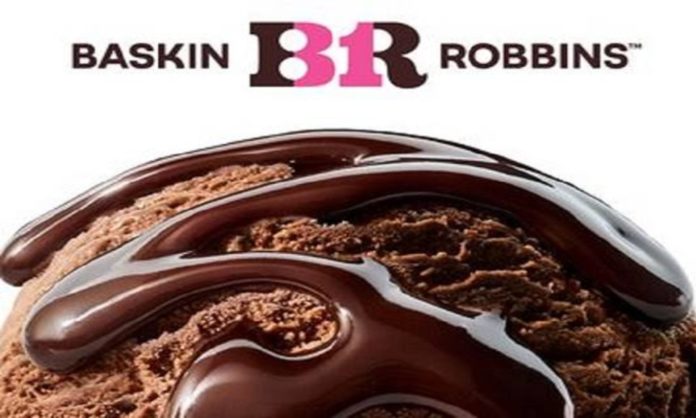
Trying to hit on those flavors of innovation and quality, Baskin Robbins has updated its logo with a new simplified font and design. The refresh also includes updated packaging and employee uniforms and joins recent digital-first refreshes from Velveeta and Burger King.
Baskin Robbins Rebrands
The 77-year old ice cream shop is tweaking its logo, employee uniforms and packaging to update the brand. It’s the first major update for Baskin-Robbins since 2006, according to the company. It will also sell merchandise, including bikes and bucket hats, from a dedicated online store for the first time. And Baskin-Robbins will unveil new flavors as part of the refresh.
In the new logo that playful font is gone, replaced by a crisper version. The new branding comes in brown and pink, brown and blue, and pink and white.
Read More: McDonald’s ‘Fries’ Crosswalk Is Grabbing Everyone’s Attention
New look, new feel, new reasons to 🥳 pic.twitter.com/I1xEFqhY6C
— Baskin-Robbins (@BaskinRobbins) April 11, 2022
“When we really think about the journey … it started four years ago,” said Jason Maceda, Baskin-Robbins president. That included “really listening to our guests.”
Baskin-Robbins president Jason Maceda and Grandinetti both noted that consumer insights shaped the direction of the campaign and the brand revamp.
“We were known for quality, but we weren’t necessarily considered innovative and modern,” Grandinetti said. “We wanted to make sure with the campaign that we leaned into changing the perception of the brand, embracing the things that we’re known for and positives, but getting away from some of those negatives. At the same time, it was really important for us to make sure it was an authentic campaign.”
For the first time in many years, Baskin Robbins is putting paid media spend behind a campaign. It’s a full 360-degree campaign across all of the brand’s channels, with both spots set to air on connected TV, online video, and streaming services.
Besides a slight color update in 2020, Baskin-Robbins has maintained the same logo since 2006.
Twitter Reacts
A relationship so sacred, of course, Twitter had to react to the occasion. But it wasn’t all rainbows and sprinkles. However, the only good thing to come out of this whole charade is merch and more merch.
Hey @BaskinRobbins I fixed your new logo. Please use this instead. Free of charge. I don’t usually do spec work like this, but this is an emergency.
Nobody will read your typeface as a 31 unless you use a wider slab font, like this one. pic.twitter.com/WGZeJ5BZOc
— Ernie Smith (@ShortFormErnie) April 11, 2022
That new logo was a catastrophic miscalculation.
It's abhorrent.
— DKA CYBR AGCY (@DunningKruger_) April 11, 2022
No loving this at all….
— AudiVemVem (@AudreyVement) April 11, 2022
The tweet definitely sums up our reaction to the new logo.
Read More: This Furniture Brand Is Making Divorce Easier With Their Products
Oooh! This would need a little getting used to. 👍🏽☺️
— G2 (@g2kaffeeklatsch) April 11, 2022
What do you think of the new logo? Let us know in the comments below!
Stay tuned to Brandsynario for the latest news and updates.

