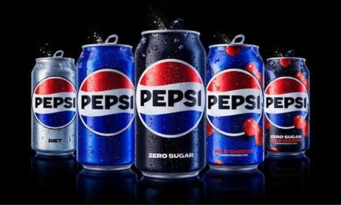
The new era of Pepsi is here as the brand gets a major makeover and redesign of its logo in years. The latest logo change has been done as the company wants to draw attention to Pepsi’s zero sugar line.
Pepsi’s Makeover For Zero Sugar
One of the reasons behind the change includes the fact that many people couldn’t quite recall the actual Pepsi logo but had an idea that it included a variant of the red, blue, and white colors and the Pepsi text somewhere on or in the circle, according to Pepsi marketing officials. The makeover is an attempt to bring about the classic essence of Pepsi in a way that can relate to the newer generation.
🚨 Welcome to a new era of Pepsi!🚨
Couldn’t be more proud to share our new Pepsi logo and visual identity that we will be rolling out in the US this fall! pic.twitter.com/OC80a6PyDd
— Todd Kaplan (@T_Kap) March 28, 2023
PepsiCo’s first-ever Chief Design Officer Mauro Porcini said,
“We couldn’t ignore that kind of insight. Instead of rejecting it, we decided to embrace it.”
“The ‘Pepsi’ in the logo is ‘decoupled from the globe'” noted Pepsi’s Chief Marketing Officer Todd Kaplan. Adding “It’s this lowercase, italicized font, the blue is a little bit muted. It doesn’t exude that confidence and energy that the brand represents.”
“A lot of people don’t even notice the black is there. It’s an intentional color we added in with [Pepsi] Zero Sugar, which will be the lead brand we use in marketing. [Black] can act as a master brand statement.”
Read More: Levi’s To Start Using AI-Generated Models
“We designed the new brand identity to connect future generations with our brand’s heritage. Marrying distinction from our history with contemporary elements to signal our bold vision for what’s to come,” said Mauro Porcini, the chief design officer at PepsiCo.
“The new logo is more digital-friendly and “introduces movement and animation into the visual system. Meanwhile, unlocking more flexibility for Pepsi to move between physical and digital spaces, from retail shelves to the metaverse.”
Read More: Huawei Launches ‘Mate X3’ – Thinnest And Lightest Folding Phone
Stay tuned to Brandsynario for the latest news and updates.


