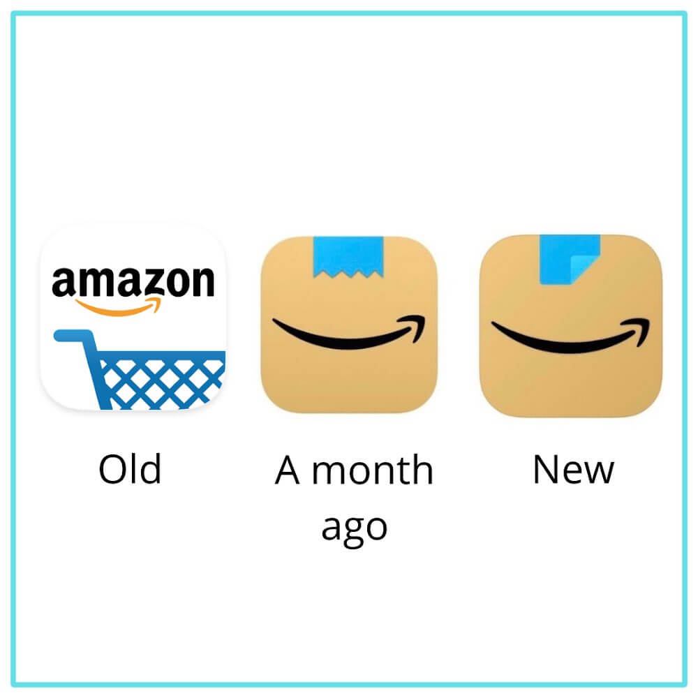
Back in January, e-commerce giant Amazon introduced a new icon that resembled the toothbrush-styled moustache popularly compared with Charlie Chaplin and Adolph Hitler. The internet made a lot of fun of that particular icon and hinted towards the resemblance of the icon to that of the German dictator.
Tweaking The Icon To Reduce The Resemblance
The toothbrush-style mustache has always been associated with Charlie Chaplin but is popularly associated with Adolph Hitler too. After people spotted the resemblance between the new icon and the controversial figure, an Amazon spokesperson commented on the fiasco. They were quoted as saying;
“Amazon is always exploring new ways to delight our customers. We designed the new icon to spark anticipation, excitement, and joy when customers start their shopping journey on their phone, just as they do when they see our boxes on their doorstep.”
Twitter Reacts To Amazon Tweaking Its Icon
The redesign of the icon rolled out yesterday which now bears less resemblance, however, there was no official announcement or press release on this new update.
unsurprisingly they did not send out a press release to announce the second redesign
— alex hern (@alexhern) March 1, 2021
Back in January, when Amazon introduced the new redesign of their icon, it sparked a lot of reactions from the public, which shows how the resemblance was not uncommon and multiple people were reminded of the similarities between the icon and one of the most controversial figures of the 20th century.
Amazons new App logo Does not remind me of Hitler… Amazons new App logo Does not remind me of Hitler…
Amazons new App logo Does not remind me of Hitler… pic.twitter.com/CAx0kWKeDm— Phil Whitford (@iamphilwhitford) January 26, 2021
Many people also expressed how the new icon reminds them of the popular TV show, Avatar.
i know the new amazon app icon is supposed to represent their packages but every time i see it i just see Aang from Avatar smiling at me lololol pic.twitter.com/kIPwneHr2p
— flipboitamidles (@flipboitamidles) February 26, 2021
Many spotted how the blue tape on the top was identical to Avatar’s Aang’s blue arrow that used to appear on his skull.
Amazon changed their app icon, I caught it out of the corner of my eye and was like since when did I have an avatar app?? 💀 pic.twitter.com/vn4uknzcNh
— katie 🫧 (@kaywhatsthetea) March 1, 2021
idk how this new Amazon icon got me feeling
— Jeen Kim (@jeenkim22) March 1, 2021
Despite many of these reactions being of criticizing nature, many people also praised Amazon for their new icon’s design because of how much it was in-line with their core product.
Amazon just updated their app icon: replacing their *actual* logo with their physical product – the box.
When your physical product is more recognizable than your logo, you're doing branding right. pic.twitter.com/HznM3EVcqf
— Zoli ⚡️ (@zolihonig) February 28, 2021
the amazon app icon is a little box 📦 s’cute! 🥲
— claire ♡ (@PrincessKlairee) February 28, 2021
Previously, Amazon’s icon used to be that of a shopping cart. However, it was changed to the new design which resembled that of their parcels. But since many people and news outlets identified the resemblance between the icon and Hitler, a new design of the icon was quietly introduced yesterday which now bears lesser resemblance to the controversial figure.
After Myntra, it’s Amazon now! @amazon revealed its new app icon a month ago, however users spotted an unfortunate design flaw!
According to them, it resembled Hitler’s moustache with a smile and hence the new logo was tweaked.#Amazon #AmazonLogo pic.twitter.com/uLkI5vKZMZ— Social Media Dissect (@SDissect) March 1, 2021
What do you think about the whole ordeal? Do you think the old logo had any resemblance with Charlie Chaplin or Hitler? Or was the OG shopping-cart icon was nicer? Let us know under the comments below.
Follow Brandsynario for more news & updates.


