Legendary brands are those that can be recognized by people with just their logos, such as Ferrari’s prancing horse, Audi’s four rings, Lamborghini’s raging bull and many more.
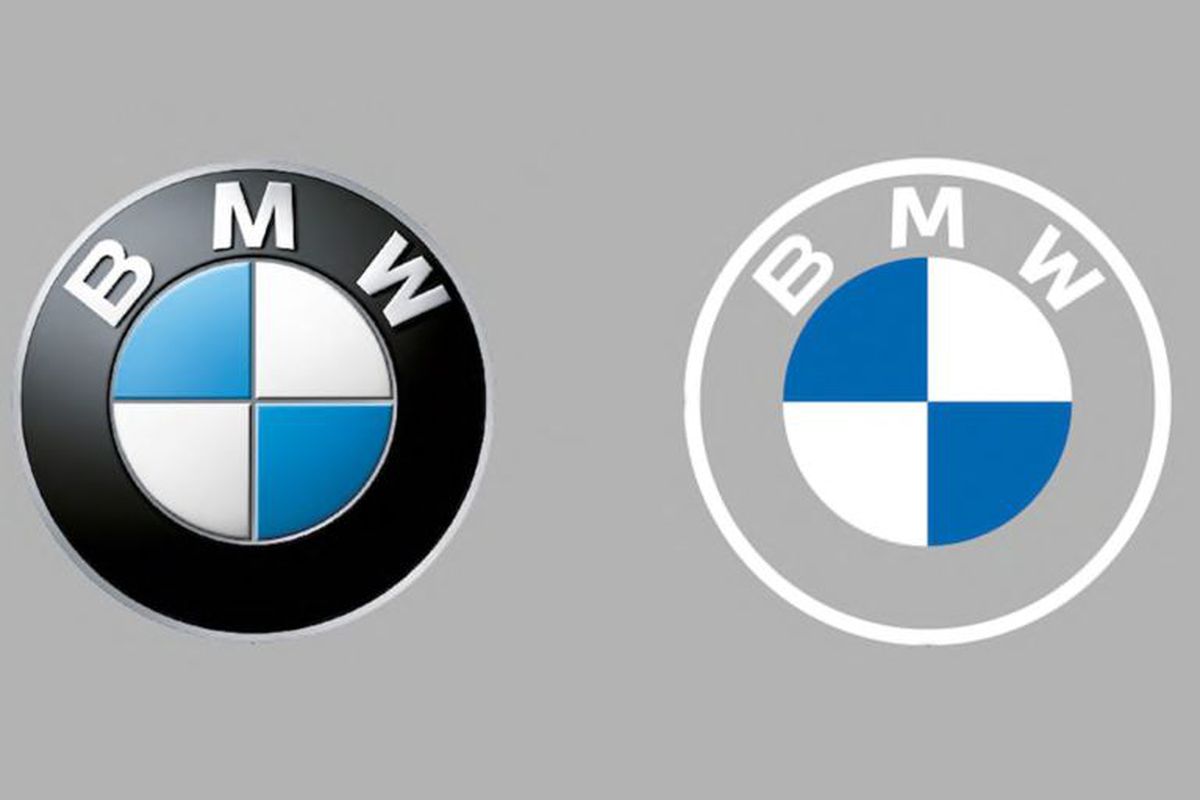
Decades have been spent in establishing such splendid brand recall where the brand can be identified without any text attached to it. In contrast to this, BMW recently revealed its new logo after 23 years and this has caused quite the stir in its fanbase.
While some have accepted the change wholeheartedly, some have absolutely hated the sudden change!

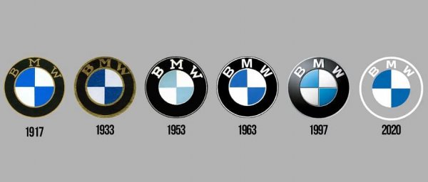
The company’s first logo was seen in 1917 after which minor changes have been made over the years however what has shocked people is the complete change in the logo where BMW has left out the black elements of the design and has decided to go with a transparent background. The last changes to the logo were made in the year, 1997.
How Has BMW’s Logo Changed Over The Years?

It is definitely going to take some time for BMW loyal customers to get used to the new change!
The company has rolled out the change only for online and offline communication purposes, pointing out that the logo is best suited for the digital age.
What Are The Main Changes Made To The BMW Logo?
- The thick outer ring in the circular logo became transparent from a previous solid black color. This means that the logo will take on the color of whatever it is set against.
2. The new design is simpler and flatter, which is a big change from the rounded three-dimensional look of the old logo
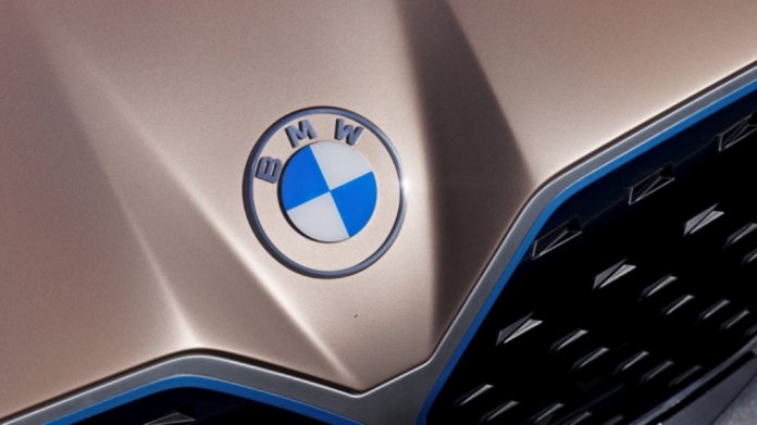
The logo made its official debut on the Concept i4 electric sedan.

However, BMW has stated that there are no plans for the new logo making its way on production vehicles in the near or even the distant future. This is good news for those who have not loved the new change!
What did you think of the new change in BMW’s logo? Love it or hate it? Let us know in the comments below.
Stay tuned to Brandsynario for the latest news and updates.


