Doritos isn’t just a brand of imported tortilla chips that Pakistanis enjoy. Well, not anymore, at least!
From munching on packets upon packets of this crunchy snack on movie nights, to using them to spice up our salad and sandwich recipes, Doritos are a major part of the entertainment in our lives.
From Logo to Lo(gone!)
What’s more, the brand has taken a major step to rebrand themselves by LOSING THEIR LOGO. Have they lost their mind? Well, no, just their logo.
Take a look:

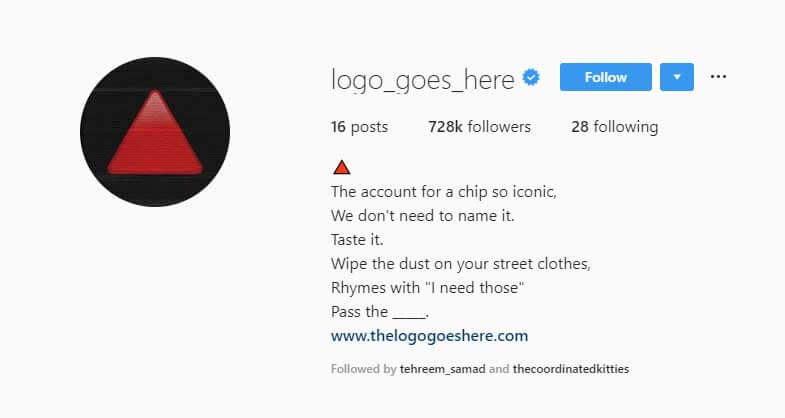
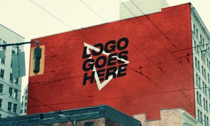
From the witty rhymes to the smartly done visuals, no where does it say Doritos, but you can still tell it’s them.
Now THAT’S branding!
Take a look at the images on their instagram account.

Triangles. Flames. The color Red. Everything but the NAME. They’ve built their brand equity so well that there is no need of mentioning even their name.
Their focus has shifted from what the brand is called to what the brand stands for and offers, and isn’t that how it should be?
What would we do with a great logo but awful, disappointing product/service?
Doritos is not producing tortillas, it is producing experiences. And we love it!
What do YOU think?
Let us know in the comments!
Stay tuned to Brandsynario for more news and updates.


