Apple has released the third developer beta of iOS 18, introducing a series of design tweaks. While it may not feature any groundbreaking additions like Apple Intelligence, the update does bring some noteworthy improvements. Among them, the revamped flashlight UI stands out.
Revamped Flashlight Controls
In previous updates, Apple introduced new ways to control True Tone Flashlights on iPhone 14 Pro and 15 Pro models. The old controls allowed for basic on/off functionality and four levels of brightness. The new system offers variable brightness and the ability to adjust the beam’s width. Initially, these controls were represented by simple vertical and horizontal lines, which took some time for users to adapt to.

However, with iOS 18 developer beta 3, Apple has made significant improvements to the flashlight interface. The updated design features a curved line that simultaneously indicates the beam’s width and brightness level. Additionally, a dotted curved line at the top shows the peak intensity mark, making it easier for users to understand and adjust settings intuitively.
Enhanced User Experience
The new flashlight UI in iOS 18 beta 3 has received positive feedback from early testers. Users have praised the design for its simplicity and functionality. One user, Willydoo, expressed excitement on Twitter, highlighting the ability to change the light focus and the impressive look of Dynamic Island in iOS 18. Another user, Sebastiaan de With, commented on how the new UI design makes the flashlight feature more enjoyable and practical to use.
Although this update may seem minor, it represents a fun and useful design shift. By making the flashlight controls more intuitive, Apple enhances the overall user experience. This change may not be revolutionary, but it adds a touch of elegance and ease to a commonly used feature.
Automatic Dark Mode for Third-Party Apps
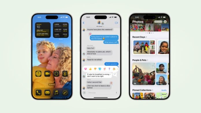
In addition to the flashlight UI overhaul, the third developer beta introduces another design improvement. Now, third-party app icons will automatically convert to a dark shade. Previously, only Apple’s native apps had new dark-tinted icons. This change brings a cohesive look to the device’s interface, particularly for users who prefer dark mode.
Apple’s iOS 18 developer beta 3 brings subtle yet meaningful enhancements to the user interface. The updated flashlight controls offer a more intuitive and enjoyable experience, while the automatic dark mode for third-party apps ensures a consistent visual aesthetic. These changes, though not monumental, contribute to a more refined and user-friendly operating system. As Apple continues to fine-tune iOS 18, users can look forward to a polished and seamless experience on their devices.
Stay tuned to Brandsynario for latest news and updates.


