In the fast-paced world of technology, even the smallest design changes in beloved devices can ignite fervent discussions and speculations among users. Just recently, Apple enthusiasts collectively held their breath as whispers emerged that the iconic red “end call” button on the iPhone might be shifting from its central position to a new spot on the user interface. However, as the dust begins to settle, it appears that the initial panic might have been a false alarm.
Apple rearranged the end call button within iOS 17 beta 6. It was moved from the bottom right to the bottom middle. pic.twitter.com/xFinlHuuAJ
— M1 (@M1Astra) August 15, 2023
The iOS 17 Beta: A Glimpse into the Future
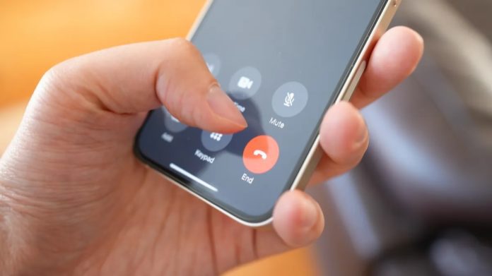
The initial shockwave swept through the Apple community with the release of the iOS 17 beta version. Offering users a sneak peek into the upcoming major update for the iPhone’s operating software. Within this beta version, users stumbled upon a significant rearrangement. The once solitary “end call” button, which has long held its place below function buttons like “mute,” “keypad,” and “speaker,” seemed to have taken on a new identity. It appeared to have joined the ranks of its fellow buttons, shifting to the lower right-hand corner of a six-button block.
Mixed Reactions and Change Reservations
This change sparked a flurry of reactions and discussions among iPhone users. Some embraced the potential for a fresh look and feel. While others were taken aback by the departure from tradition. The central position of the “end call” button had become almost synonymous. With the iPhone experience, making this rumored shift a considerable point of contention.
The Beta’s Unpredictability
However, technology enthusiasts soon discovered that the saga was far from over. Images of the latest iOS 17 beta, shared by multiple media outlets. Revealed a surprising twist in the narrative. The red “end call” button was back at its familiar center position on the phone dialpad. Yet, it wasn’t alone; now situated in the second row of a six-button block. It shared space with its neighboring buttons. Challenging users to hang up without accidentally engaging other functions.
A Window into Apple’s Design Process
Beta software releases, by nature, tend to be experimental and subject to change. They serve as platforms for engineers to identify and rectify bugs. And importantly, to gauge user reactions to alterations. As a result, conclusions drawn from beta releases can be tentative, with the final design often deviating from the early versions.

In the case of the “end call” button’s shuffling act, Apple’s traditional silence on its design decisions muddies the waters further. The tech giant is known for its secretive approach to product development. And it’s not unusual for them to avoid commenting on design choices or other details. A request for comment from The Associated Press went unanswered, leaving users and tech enthusiasts to speculate on the fate of the button’s position.
Navigating innovation
As technology enthusiasts, we find ourselves at the crossroads of innovation and familiarity. The iPhone’s interface is deeply embedded in our daily lives, shaping how we communicate, work, and play. While changes are essential for progress, they can also stir up nostalgia and discomfort when they disrupt the familiar patterns we’ve grown accustomed to. Apple’s design philosophy, characterized by clean lines and intuitive interfaces, is a hallmark of its brand, making even the tiniest alterations noteworthy.
In the end, the saga of the “end call” button’s journey through the iOS 17 beta serves as a reminder of the dynamic nature of technology and the evolving relationship between users and their devices. While the final fate of the button remains uncertain, it’s clear that the Apple community’s passionate engagement with even the minutest design tweaks underscores the significant impact that these devices have on our lives. As we eagerly anticipate the official release of iOS 17, we can be sure that the journey of the red button has added an extra layer of excitement to the evolving iPhone experience.


