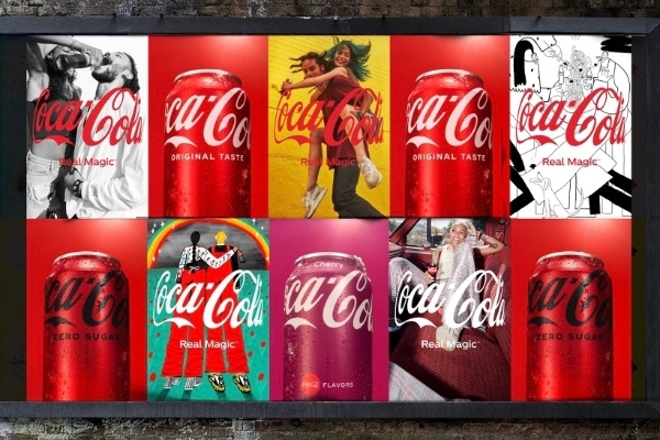
Coca-Cola has got a logo update and we expected nothing less than an endearing, thoughtful, and well-crafted upgrade. There’s no radical change, neither is it something that will break the internet. It’s a subtle change that cements their latest campaign that focuses on enhancing the togetherness of our world. Have a look at the updated Coca-Cola logo:
The New Logo Making Rounds on the Internet
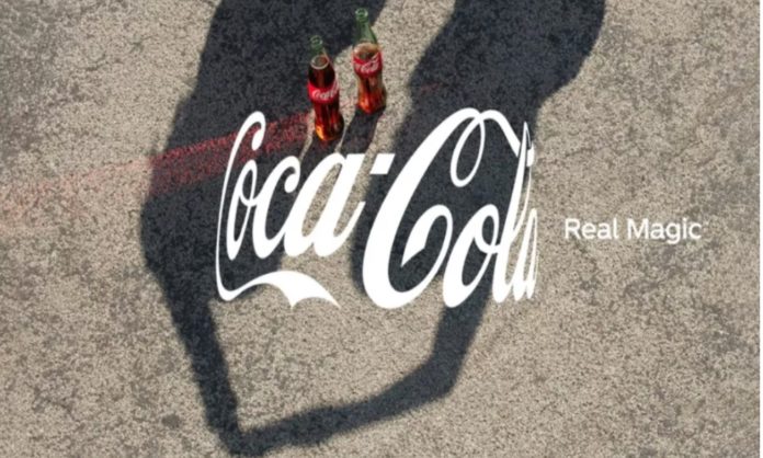
Coca-Cola is a huge company which means it is neither feasible nor advisable for them to change their logo every day. However, once in a blue moon, they will manage to steal more hearts with a subtle change here and there. They have just tweaked their original logo. The new Coca-Cola logo is a wrap-around format which is being called “the hug” logo. In other words, the design and execution is plain genius work.
What’s Different?
The redesigned logo essentially features the traditional Coca-Cola logo, however, it is slightly curved. The design is meant to show the logo wrapped around something, but what? If you’re a true Coke lover you’ll know it’s wrapped around an invisible Coke bottle! The company plays upon its fans’ ability to recognise the bottle even when it’s technically not there.
The logo is inspired by togetherness according to the company. Moreover, if you dig deeper, the curve symbolises the action of a hug (like arms midway through the hug!)
Read more: Brand Wars: Pepsi Zero Sugar Takes A Dig At Coke Zero
The Accompanying New Campaign
Did you think there’d be no campaign coming with it? Don’t underestimate Coca-Cola. There is a new campaign, and the tagline for it is “Real Magic.” The ad shows Coke always resolving conflicts and bringing peace and cooperation.
The Chief Marketing Officer Manolo Arroyo at Coca-Cola said, “Real Magic is not just a tagline but a philosophy,” that the company lives by and hopes to inspire in others.
As a result, the campaign also features the work of a number of artists and photographers that focus on celebrating togetherness and inclusivity. The ad and the campaign are brimming with happiness and diversity imparting the message of ‘togetherness’.
Loved on Twitter
The ad, campaign, and new logo are also very well-received on social media. Twitter users have expressed their love for Coca-Cola’s latest update and the love is contagious. Many others have also stepped up and tweeted about how the new logo is something that cheers them up and makes their day. Have a look:
Coca-Cola ‘s marketing moves are always fascinating . The iconic brand has launched a new global platform Real Magic which will pay odes to humanity. And its logo is taking a curved shape to represent a Hug. From the old Open Happiness to new Hug for humanity. In sync with times! pic.twitter.com/0dnbmvakaY
— Chitra Narayanan (@ndcnn) October 1, 2021
Coca-Cola’s HUG Icon ❤️ campaign is truly happiness to look at. pic.twitter.com/A8TDgq3ngY
— The Something Guy 🇿🇦 (@TheSomethingGuy) October 3, 2021
Read more: Twitter Reacts To BBC Defending Its New Expensive Logo
Stay tuned to Brandsynario for the latest news and updates.


