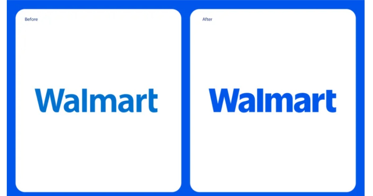
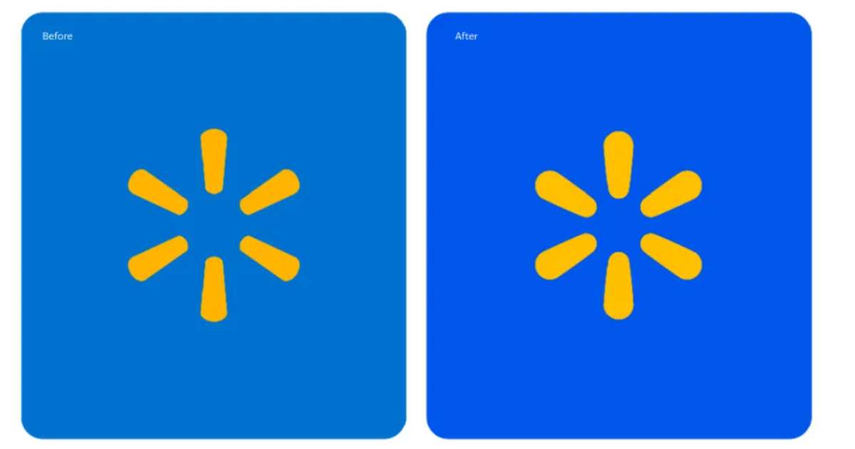
In January 2025, Walmart unveiled its first logo redesign in nearly two decades, aiming to reflect its evolution as a modern, digital retailer. The updated logo features a chunkier font inspired by founder Sam Walton’s classic trucker hat, a deeper blue colour palette dubbed “True Blue,” and a refreshed yellow spark symbol known as “Spark Yellow.”
The Internet Reacts: Spot the Difference
As soon as the new logo was revealed, the Internet went berserk. Netizens took to social media to express their confusion. One user quipped, “Walmart just unveiled their new logo. It looks the f****** same.”

Another chimed in, “I can’t believe someone got paid for this.”

Memes comparing the old and new logos flooded timelines, with hilarious captions like, “Did Walmart release a new logo or a vision test?”
Now the question is: can you spot the difference?
Read more: Mazda Revamps Its Iconic Logo
Walmart’s Justification: A Nod to Heritage and Innovation
According to William White, Walmart’s Senior Vice President and Chief Marketing Officer, the refresh is “rooted in the legacy of our founder, Sam Walton.”
The company highlighted that the new design is a display of its growth since now Walmart aims to be more than a simple retailer.
Critics’ Take: Money Well Spent?
Critics and consumers alike have questioned the financial prudence of investing in such a minimal redesign. Comments like, “How much do you think they paid for this? $1M? $10M? $100M,” and “Some consulting firm fleeced them for $500M for this,” reflect a widespread sentiment that the changes are too insignificant to warrant the likely substantial expenditure.
Branding Experts Weigh In: Subtlety Speaks Volumes
Branding experts argue that even minor tweaks can have significant psychological impacts. They reinforce brand identity and signal modernisation. The retention of the yellow spark and the shift to a deeper blue are seen as efforts to balance tradition with a fresh, contemporary look. However, the general public’s lukewarm reception suggests that the nuances may be lost on the average consumer.
Walmart’s logo redesign has certainly achieved one thing: it’s got people talking. The new logo is the subject of discussions all over the internet. On one hand, it can be viewed as a symbol of the past and modernity. On the other hand, it can also be seen as an unnecessary waste of money on an almost imperceptible change. But just the possibility of controversy is a promising sign of achievement in the world of branding. After all, there’s no such thing as bad publicity.
Walmart expects that the new logo will be featured in its 10,500 stores, and time will tell if the weird rebrand will either be accepted by the consumers or will be an embarrassing moment in Walmart’s History.
Stay tuned to Brandsynario for the latest news and updates.


