Chupa Chups, which was started in 1958 by a Spaniard named Enric Bernat, is now controlled by the Italian-Dutch conglomerate Perfetti Van Melle, which also owns the Mentos, Smint, and Fruitella brands. The Spanish verb chupar, which means “to suck,” is where the name Chupa Chups originates.
Chupa Chups & It’s Iconic Logo
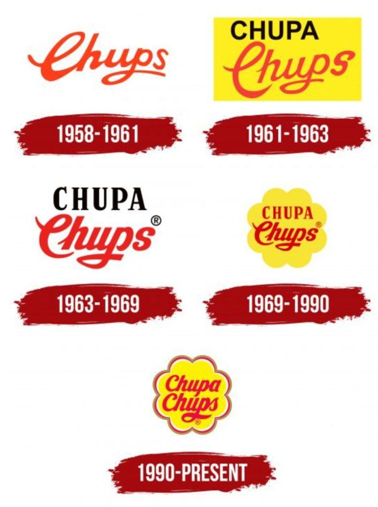
The logo of Chupa Chups went through major transformations over the decades. Only in 1969 did the first version of the iconic Chupa Chups logo appear. Before that, designers experimented with style to make the design appealing to the target market and easy to understand.
Read More: Snap, Break, And Unwind With KitKat And Its New Ad
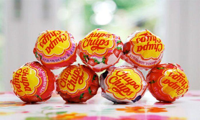
Salvador Dali, a Spanish painter, designed the 1969 logo. The owners of the candy company commissioned the renowned artist to create their interpretation of the Chupa Chups logo. Dali enclosed the company name in the flower. The chamomile shape is both simple and distinctive at the same time. By the way, the renowned surrealist suggested positioning the logo on top of the lollipops rather than on the side to grab buyers’ attention right away.
“In 1969, Dali was approached to design a new Chupa Chups logo, and the result became as instantly recognizable as his melting clocks. Dali incorporated the Chupa Chups name into a brightly colored daisy shape. Always keenly aware of branding, Dali suggested that the logo be placed on top of the lolly instead of the side so that it could always be seen intact.” Quoted from BBC’s Modern Masters: Dali, Chupa Chups logo.

An adorable illustration of how art and commerce can unexpectedly and pleasantly meet is Salvador Dali’s design for the Chupa Chups logo. This endearing tale serves as a reminder of how creativity can bring life to even the most commonplace elements of life and emphasizes the importance of a distinctive visual identity in determining the success of a brand.
Read More: Discover The ‘Magic’ of Coca-Cola with These 7 Amazing Hacks
Stay tuned to Brandsynario for the latest news and updates.


