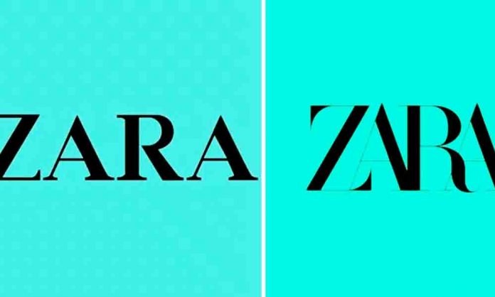
This week, fashion giant Zara revealed a new logo on its social media platforms and seems like its target market worldwide has rejected the transformation.
A Case of Redesigning Gone Wrong
Designed by the agency called Baron & Baron, the logo is similar to the old one, except the letters are taller and overlap with each other.
This was the original logo of Zara
Zara mocked for 'ridiculous' new logo – as fans say they 'miss the old one' https://t.co/Y7V8hJ4CL5 pic.twitter.com/iTGx7hhQ7M
— I Know, Right? (@_I_Know__Right_) February 1, 2019
And this is how the new one looks like!
ZARA has unveiled its new logo:
👍 or 👎?https://t.co/TIZJ38NOmJ pic.twitter.com/GJSUz1EQWR
— highsnobiety (@highsnobiety) January 29, 2019
Apparently, the redesign has stirred a worldwide debate with fans ridiculing the brand for making the logo too difficult to read.
For many, the logo now gives a ‘claustrophobic’ vibe.
So what’s everyone’s thoughts on the new #Zara #Logo !??
Personally… we preferred the old one, the lack of space on this new one makes us feel a bit anxious. #whythelackofspace 🤔 pic.twitter.com/Xw1j7xyzBe
— Kornerstone Creative (@KornerstoneC) January 31, 2019
And now they want the spaces between the letters to return!
Seriously #ZARA, what the hell??
You forgot the spaces! #zaralogo #WhatHappened #failrebrand pic.twitter.com/cljuTrp8bS— Silvia Sguotti (@SilviaSguotti) January 30, 2019
On a lighter note, people couldn’t stop taking digs at the brand!
The new Zara logo is actually me trying to squeeze into their clothes…😰 pic.twitter.com/KNBR5BHg4F
— Keyser Jöse (@captl_P) January 29, 2019
ZARA’s new logo is new me tryina fit into my old jeans 👖 #Zara pic.twitter.com/08vcqctZtJ
— CAROLINA (@i_am_caro_) January 30, 2019
Why does the new Zara logo look like a 10 year old designed it on Wordart?
— fash mag slag 👄 (@notorious_twub) January 30, 2019
People are questioning that why fix something that’s not broken!
Why have #Zara even changed their logo?! There was nothing wrong with the old one. Don’t think something if it’s not broken
— Roxie (@Roxiesthoughts) January 30, 2019
AdAsia Comes to Pakistan After 30 years: Logo & Creative Identity Unveiled
It is Rightly Said Not to Mess With the Classic
Brands usually redesign a logo when they have a new business focus or the logo looks outdated.
Marketers suggest that the transformation should never be so drastic and should retain its old identity. However, sometimes it’s better to leave things as they are.
Whilst it is a tricky move by the brand, it can lead to unprecedented success if it goes right.
However, but when it goes wrong, it can lead to a huge marketing disaster.
Seems like the same happened with Zara. While the old logo was working just fine for the powerhouse, the jumbled, overlapping typography turned out to be a wrong move.
What do you think of Zara’s new logo? Let us know in the comments below.


